Interior styling rarely fails because of the big ideas — the sofa, the rug, the paint color. It is the small, repeated details that quietly drag a room down: the art hung too high, the lamp that is too bright, the cushions arranged like a catalog. None of these is a design failure; they are learnable habits. Here are the common interior styling mistakes we see most, and the quick fixes for each.
Hanging art at the wrong height
The classic fix: hang art so its center sits at roughly eye level, about 145-155 centimetres from the floor — except when it is over a sofa or console, where the bottom edge should sit just 15-20 centimetres above the furniture. Too-high art is the single most common styling mistake in real homes.
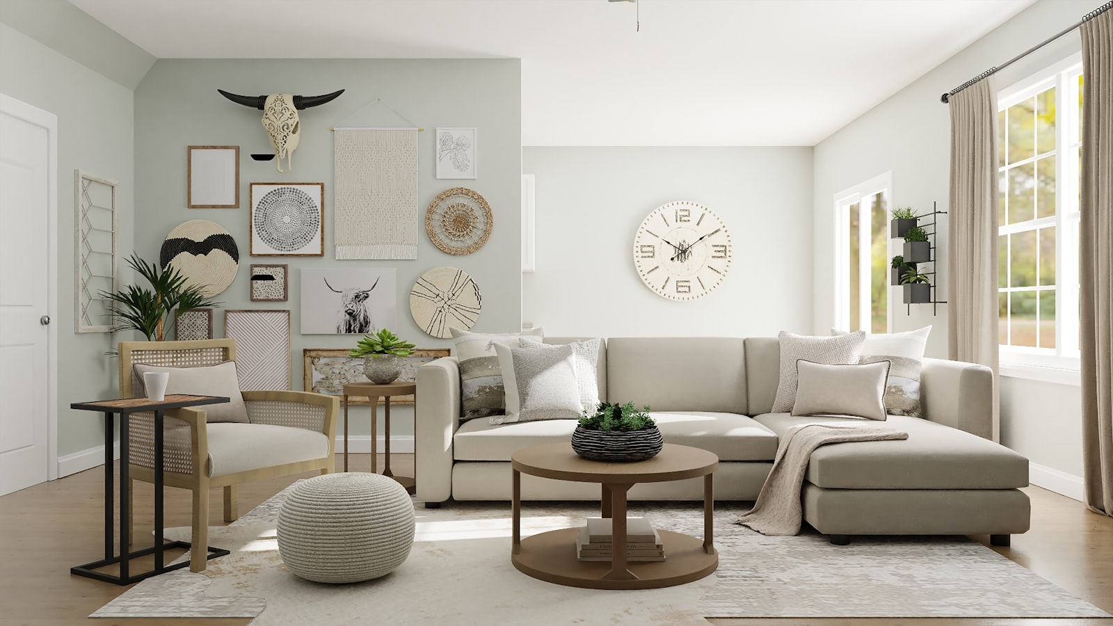
If a piece is too large or too small for its wall, swap or add a second piece rather than hanging alone in an awkward spot. A well-proportioned group makes a wall look planned.
Lighting that is all overhead
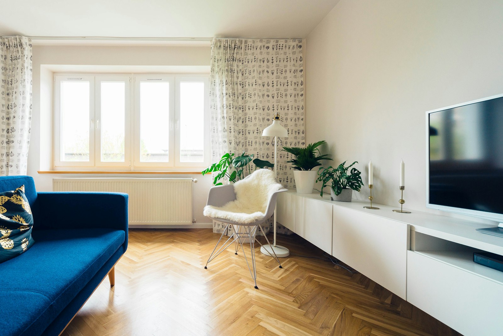
A room lit only by its ceiling fixture sits in flat, shadowless light — the opposite of cozy. Add at least one warm floor lamp, a table lamp, and (if possible) a dimmer, and light will do the styling for you. Evening rooms should glow from below eye level, not blaze from above.
Pushing everything against the walls
Rooms arranged like a furniture showroom — everything lined up against the walls — feel undecided and smaller than they are. Float a sofa slightly into the room, angle a chair toward the focal point, and give the arrangement a center of gravity. For more, our furniture placement guide covers traffic flow and anchoring.
Matching sets instead of coordinated vignettes
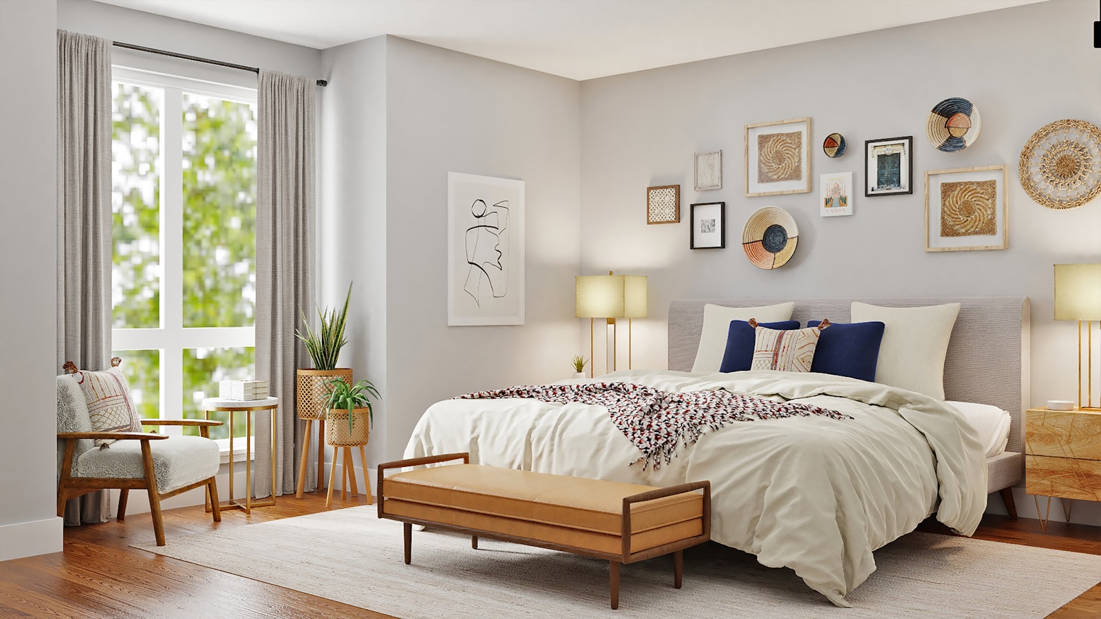
Matching everything — the full bedroom suite, the twin identical sconces at identical heights on identical end tables — makes rooms feel showroom-stiff. Matching is fine for anchors; variety is what adds soul. Coordinate through color and material instead of exact duplication: different nightstands in the same wood, lamps that echo rather than mirror.
Over-stuffing every surface
The belief that a surface must be filled is behind most cluttered styling. Leave generous negative space: one tray of small objects on the coffee table, one lamp and one cluster on the console, one vignette on the bookshelf band. The styling rule is to build up from empty, adding until it looks right — not the reverse.
Forgetting texture and scale balance
Rooms that look flat usually lack texture; rooms that feel off usually have a scale broken. Add wool, wood, linen, and greenery, and check proportions — the tiny rug under the oversized sofa, the delicate lamp beside the chunky chair. Rebalance the one mismatch, and the room clicks.
Let the room develop its own rhythm
Fix these habits, and styling stops being intimidating. The room will still look lived in — that is the point. Let the composition develop a little before you judge it; a room, like a garden, looks best when it has been allowed to settle. And when you are ready for the bigger picture, our cohesion guide will pull the whole home onto one thread.