The living room is where you unwind, read, talk late into the evening, and pile under a blanket on a gloomy afternoon. Color quietly decides whether that room feels like a calm retreat or a space you are always a little distracted in. The good news is that choosing calm living room colors is more of a method than a mystery.
Here is how to build a palette that feels soothing, looks cohesive, and still has enough interest to keep the room from feeling bland.
Start with the color you want the room to whisper
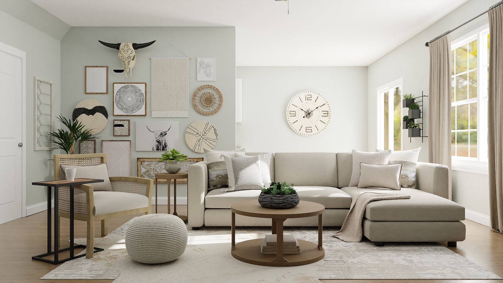
Every calm room has one dominant underlying tone — warm sand, cool grey-green, soft greige, or a barely-there blue. Pick one you can live with, not just admire in a photo. That tone becomes your wall and large-furniture color: the backdrop that everything else responds to.
A useful trick is to choose your largest fabric first — the sofa — and pull the wall color from a shade that sits a few steps lighter on the same color card. That builds immediate harmony without any guesswork.
Follow the 60-30-10 rule
A simple ratio keeps a palette calm instead of chaotic: roughly sixty percent of the room in your dominant neutral (walls, largest furniture, rugs), thirty percent in a secondary tone (curtains, additional seating, large decor pieces), and ten percent as a subtle accent color used sparingly in pillows, art, and small objects.
When the accent stays under ten percent, you can choose a slightly deeper or richer version of your palette without raising the room\u2019s energy. The room reads as cohesive and restful, with just enough personality to feel intentional.
Choose muted over saturated for the calm effect
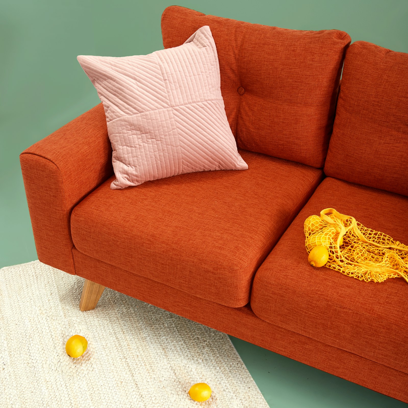
Muted, softly-blended tones are the quiet stars of calm interiors. Think sage rather than emerald, dusty blue rather than royal blue, clay rather than burnt orange. Muting a color — adding grey or brown to soften it — brings it closer to the neutral family, so rooms blend instead of clash.
This is why the creamy neutral-family palettes feel so restful: they sit close together on the color wheel, and nothing shouts for attention. If you love a bold accent color, keep it in small doses — one reading chair, one other piece of art — and let everything else stay quiet.
Use warm wood to anchor the palette
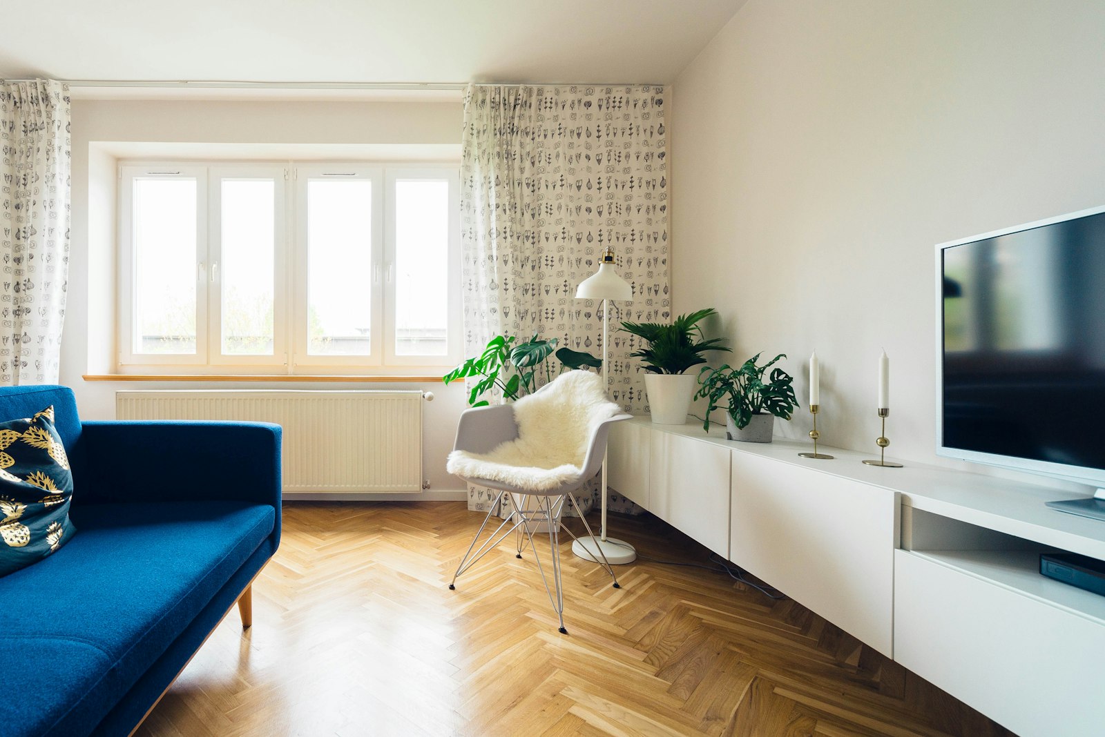
Natural wood brings a calm room to life more dependably than any other material. A warm oak coffee table, rattan accents, a walnut sideboard, or even simple wood-framed mirrors add organic texture that makes a neutral palette feel rich rather than flat.
Keep wood tones cohesive — pick one or two nearby finishes and repeat them — rather than mixing yellow pine, grey oak, and cherry in the same space. When the wood family is consistent, the room reads as composed.
Layer texture when color is calm
A calm color palette relies on texture to avoid feeling sterile. A chunky knit throw, linen curtains, a wool or jute rug, velvet cushions, and a leather pouf all add depth that reads as warmth. In a muted palette, texture is doing the work that contrast would do in a bolder scheme, so make it generous.
Mix at least three textures in any seating group: smooth (linen velvet, wood), coarse (wool, jute), and soft (fleece, cotton knit).
Pulling the whole scheme together
None of this requires a designer\u2019s budget — a calm palette is as much about subtraction as purchase. Swap one saturated rug for a muted one, move two loud pieces of art into a hallway, and add a single warm wood accent, and the room will visibly exhale.
Once your colors feel settled, polish the finishing details with our guide to building a cohesive home decor style, which turns a pleasant palette into a fully composed look.